Client: Transnetyx
Role: Design System
Date: Mar 19. 2024

A design system acts like a dictionary, providing the vocabulary for component creation. The YX Design System is crucial for Transnetyx, enhancing the consistency, aesthetics, and accessibility of our four biotech services — Colony, Sequencing, Genotyping, and A-tune — within the Transnetyx web app. It converts these aspects into reusable components, fostering a culture of autonomy and collaboration to maintain a cohesive design framework.


As the product designer, I had the exciting opportunity to develop, oversee, and refine the YX design system for W3C, PrimeNG, and the React library. My role involved setting up design foundations, building components, and creating comprehensive design guidelines. I also teamed up with the implementation team to produce detailed documentation, ensuring a smooth and consistent user experience across all Transnetyx products.

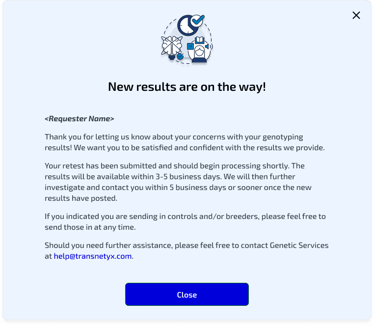
A year ago, Transnetyx faced design inconsistencies, duplicated efforts, and inefficient development processes, leading to a fragmented user experience and significant time wastage. Ensuring accessibility and maintaining design quality were challenging without standardized components. To address these issues, I implemented the YX Design System, providing a consistent, scalable, and efficient framework. This system enhances brand consistency by 78% and streamlines workflows by 44% across all touchpoints through cohesive customer experiences.
By implementing components and design tokens, searching through the assets from the left toolbar can be selected and adjusted using various booleans, instances, or properties on the right toolbar. This process allows for extensive customization, ensuring the components seamlessly integrate into new designs. Designers can tweak attributes such as color, size, and behavior to match specific project requirements. This approach not only maintains a consistent visual language across the platform but also enhances the design-to-development workflow. The ability to finely tune components ensures that each design is tailored to its unique context while adhering to overall design standards, ultimately improving efficiency and collaboration within the team.


In this table component, we can adjust its state by changing the number of columns and editing the content of each column. The columns can be customized to display various elements, such as buttons, inputs, strains, icons, and more. This flexibility is a core feature of the YX Design System, which prioritizes adaptability and user-friendly customization. By leveraging design tokens and modular components, the system allows for seamless integration and consistency across different interfaces.
Classification
In our design system, we have meticulously crafted product-specific components tailored to our four distinct products: Colony, Sequencing, Genotyping, and A-tune. Each of these products has unique requirements and functionalities, and our design system ensures that these specific needs are addressed with precision.


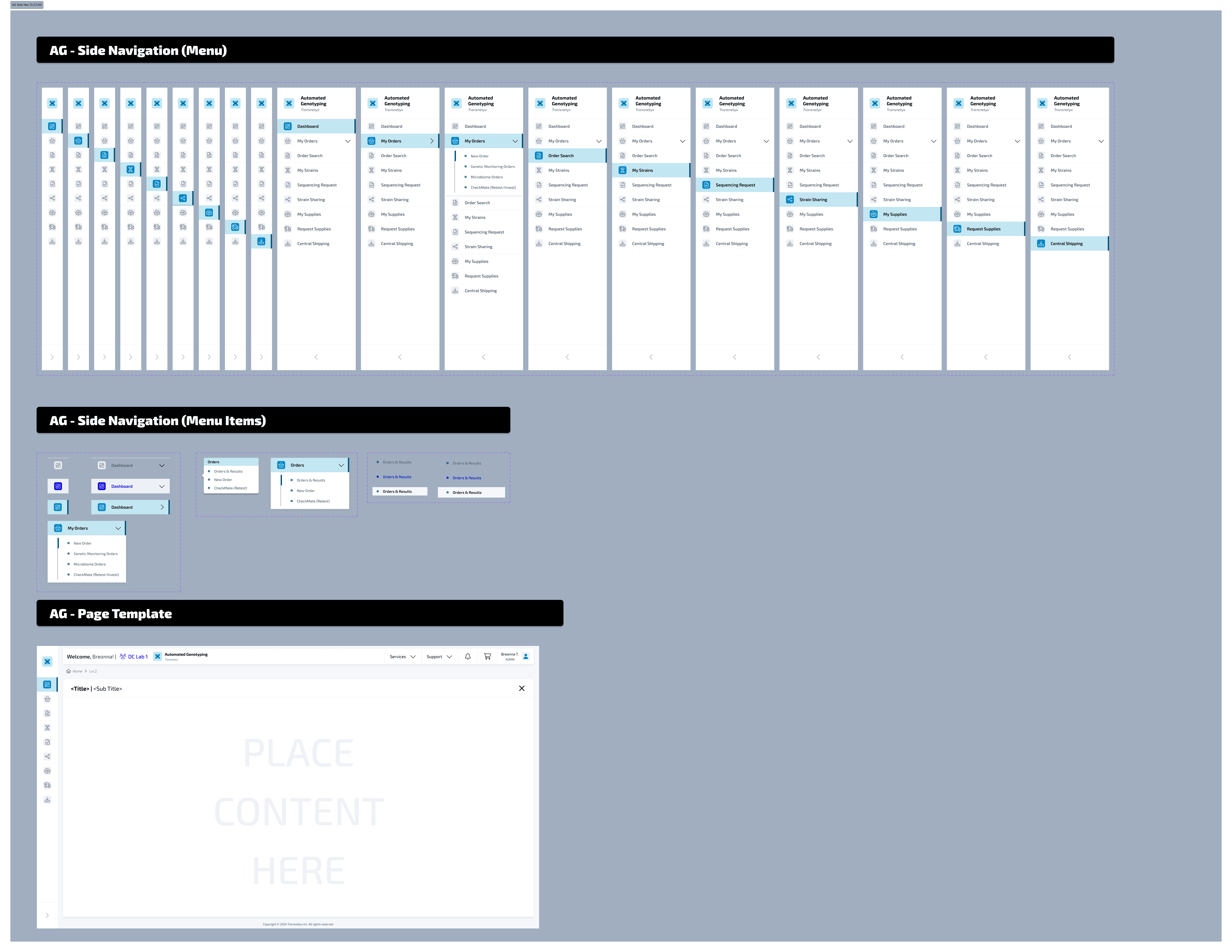

In order to offer a visual distinction for each product, we've established individual color schemes for Colony, Sequencing, Genotyping, and A-tune. You'll find these distinct colors echoed throughout the navigation menus, headers, and general aesthetics of each product. This provides not only a stimulating visual differentiation but also allows users to swiftly recognize the product they are engaging with, thereby enhancing the overall user experience. Adopting this strategy boosts not just the artistic and efficient cohesion of our offerings but also promotes a cooperative and self-reliant atmosphere amongst our design and development teams, empowering them to work effectively within an integrated design structure.
In addition to these product-specific components, our design system also includes grouped components that apply universally across all four products. These shared components, such as inputs, accordions, dropdowns, and modals, ensure a consistent user experience and streamline development processes. By leveraging these reusable elements, we maintain design consistency, improve accessibility, and facilitate easier updates and scalability across the entire Transnetyx platform.

Every day, a wide range of users engage with our YX Design System, including designers, developers, and product managers. Documentation plays a vital role in our team's success, offering design notes on effectively utilizing the design system.
This not only helps users navigate the system but also enhances the maturity and expertise of the team.
Our guidelines cover a broad spectrum of topics, including accessibility, design patterns, behavior standards, usage instructions and practical examples. This extensive documentation ensures that everyone can make the most of the YX Design System, fostering a cohesive and proficient team environment.

Universal and accessible
to everyone.
With apps to bolster and enrich the design schema.


Color Contrast
All elements met WCAG AA standards.
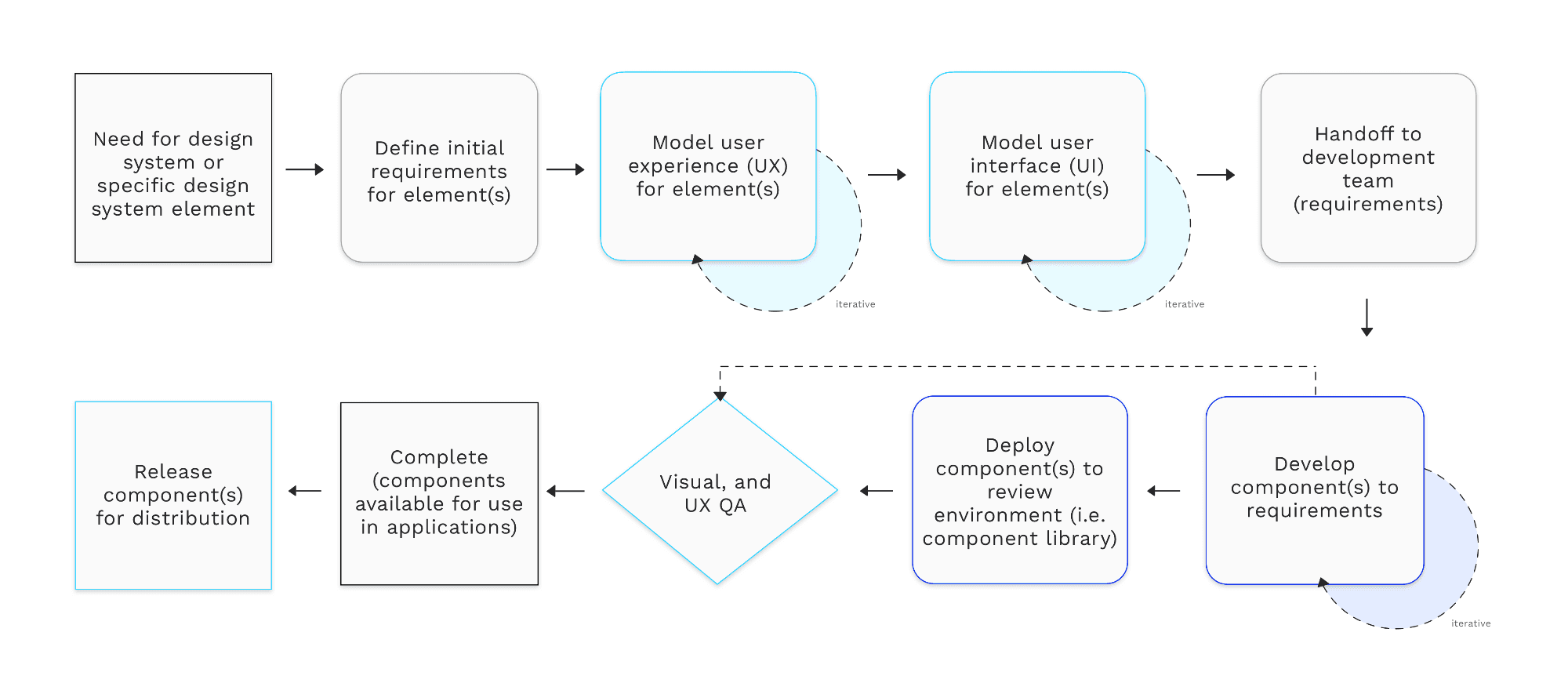
Due to the limited resources of our design team, the YX Design System employs a contribution model to efficiently expand the library through our weekly design sync. We actively promote inner-sourcing within our design and development community, which helps bridge the gap between existing components and new patterns needed by product teams.
Rather than operating as a separate team that independently builds and maintains the library, we function as an extension of the product team, ensuring quality governance and system thinking. We have established a streamlined collaboration process and contribution guidelines to empower product teams, allowing the YX Design System to scale alongside Transnetyx's growth.
Figma Libraries to support 3 web development framework
PrimeNG
Constant communication is our key to success in the YX design system. Regular dialogue between designers, developers, and stakeholders ensures that everyone is aligned and working towards the same goals. This ongoing exchange of ideas and feedback allows us to quickly address issues, adapt to changes, and continuously improve our components and guidelines. By fostering an open and collaborative environment, we enhance our ability to create a cohesive, efficient, and user-centered design system that meets the evolving needs of our projects.

I will need it for tmr's design sync!