Client: Scotiabank
Role: Design System
Date: Aug 2024
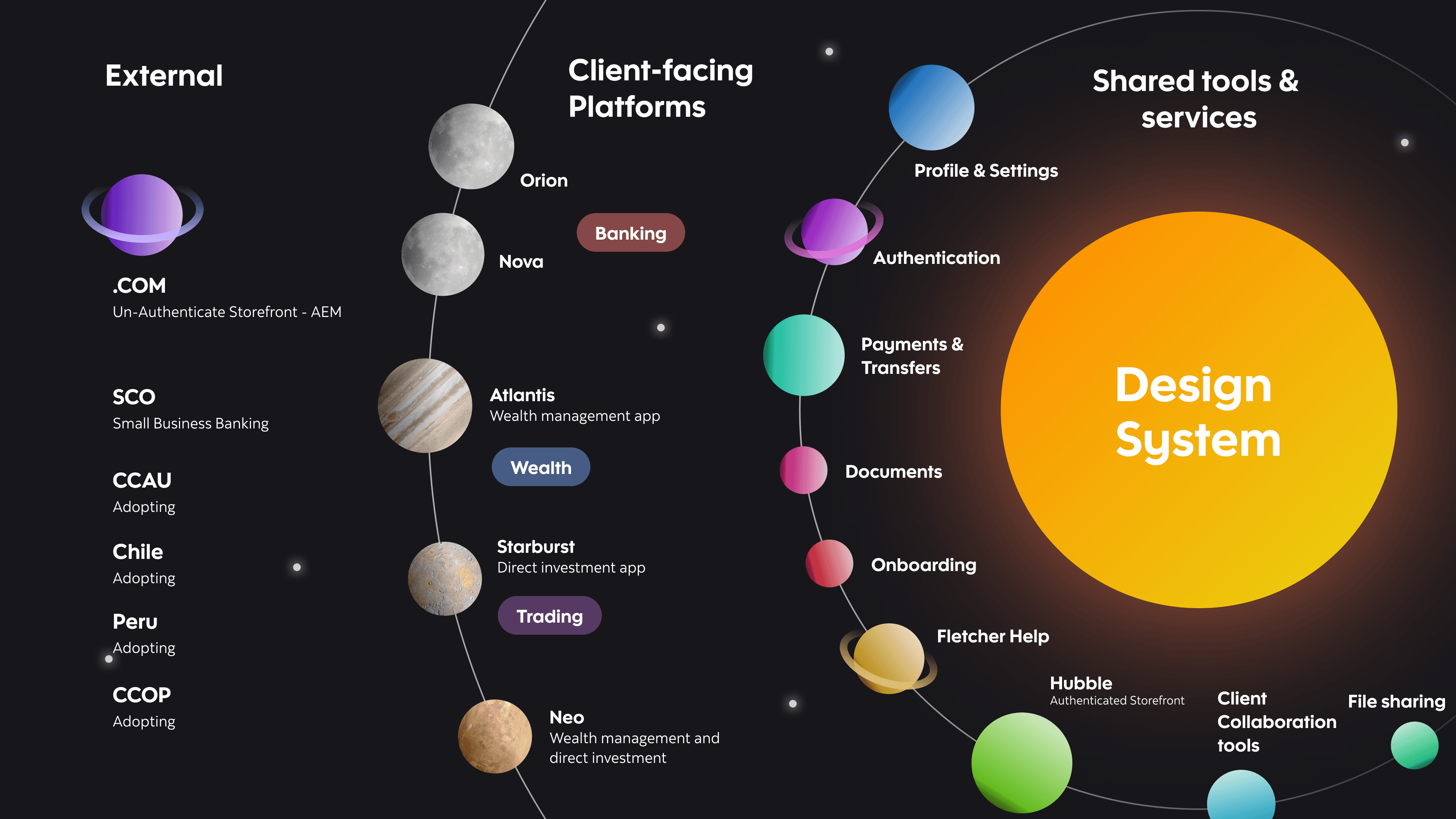
When I first started working with Canvas, Scotiabank Digital’s design system, I quickly saw its potential—but also its limitations. As a senior product designer, my role extends beyond just crafting interfaces; it involves ensuring that our design system is scalable, accessible, and efficient. That means defining UX/UI patterns, behaviors, accessibility criteria, and use case guidelines in Figma while championing best practices across our global design community in Canada, Chile, Colombia, Mexico, and Peru.
As our teams grew and our digital products evolved, it became clear that Canvas Core was no longer meeting our needs. Designers were struggling with bloated libraries, developers faced inefficiencies in handoff, and scaling across multiple platforms was proving to be an overwhelming challenge. Canvas 2.0 wasn’t just an upgrade—it was a necessary evolution to ensure our design system could keep up with the demands of a rapidly growing organization.


At first, Canvas Core worked well. It provided structure and consistency across our digital products. However, as more teams adopted the system, cracks began to show:
Duplication of Libraries: Every new platform or business line required separate versions of the same components, leading to inefficiencies and inconsistencies.
Scalability Issues: The design system wasn’t equipped to support the expanding number of business lines, platforms, and global teams.
Inefficient Design-to-Development Handoff: Developers spent excessive time translating designs into code due to the lack of an automated system.
Limited Theming Capabilities: Customizing the system for different products required duplicating entire libraries, increasing maintenance overhead.
High Maintenance Costs: Every component update had to be manually applied across multiple instances, consuming valuable design and engineering time.
The video below highlights a clear example of the challenges we faced with Canvas Core. Our old Multi-Select component had over 700 variants—just in the React library alone, not including the mobile version. It supported both light and dark modes and contained 13+ interaction states, making it incredibly difficult to manage.
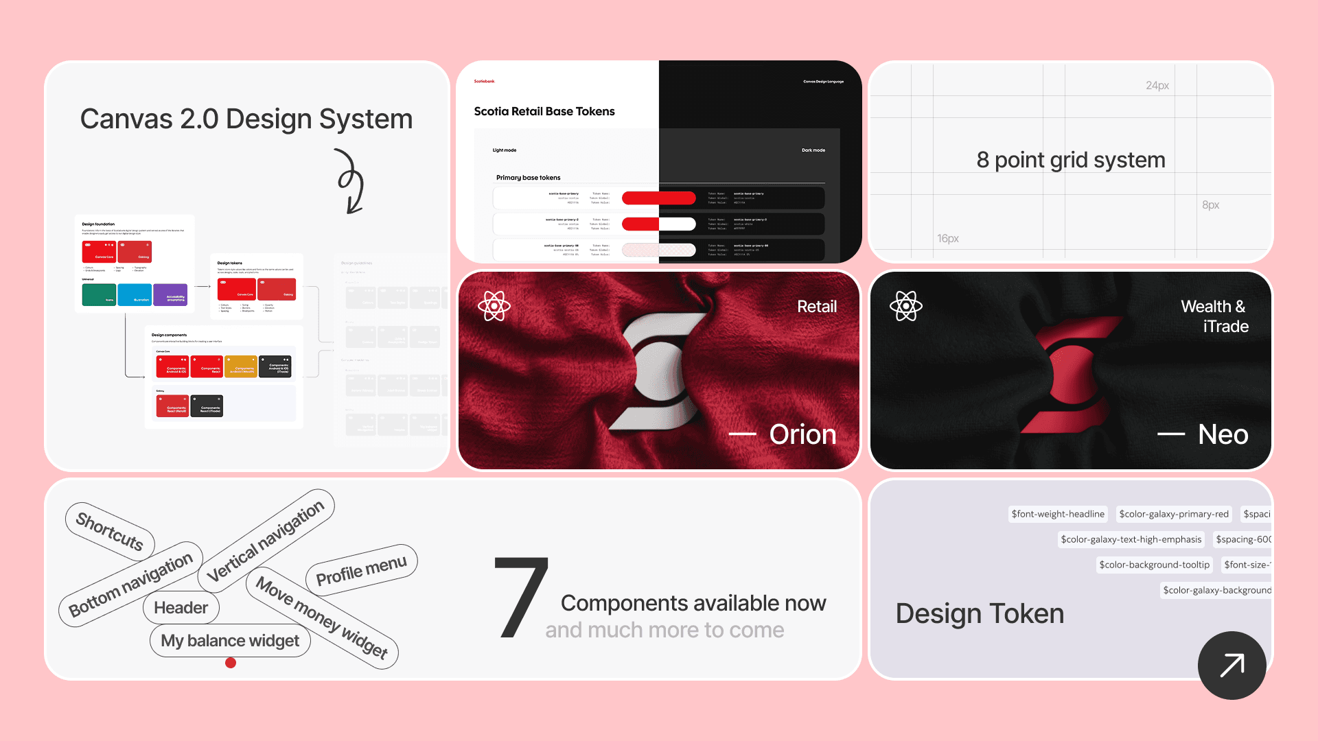
The goal of Canvas 2.0 was to create a sustainable, scalable design system that:
Reduced redundant components and streamlined workflows.
Provided clear, accessible documentation within the same file.
Simplified component structure using the latest Figma features.
Introduced a design token foundation to enable seamless theme switching.
Strengthened collaboration between designers and developers through improved automation.
This wasn’t just about making Canvas more efficient; it was about creating a system that empowered designers and developers alike.

One of the major challenges in Canvas Core was the overwhelming number of component variants. In Canvas 2.0, we reorganized our components by utilizing Figma’s new Properties feature, streamlining the system while maintaining flexibility.
For instance, the Multi Select component, which previously had dozens of variants, has now been simplified into a single, versatile component. Nested components now reveal only the essential properties, ensuring customization while preserving consistency, as demonstrated in the first video below. Additionally, documentation is now integrated directly into Figma, making it easier for designers to understand how to use components without needing to reference external guides, as shown in the second video below.
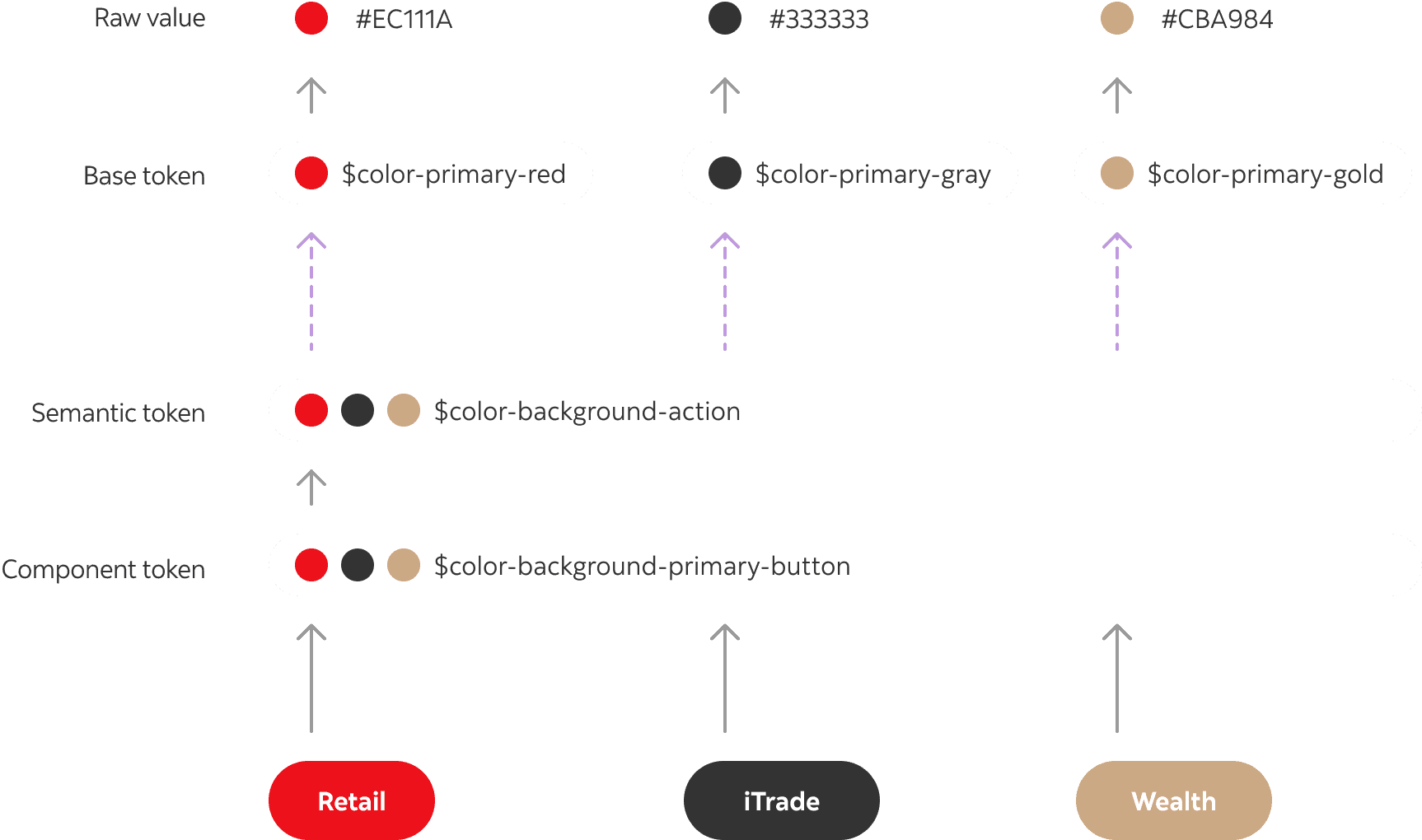
Previously, theming in Canvas required duplicating entire libraries. With Canvas 2.0, we introduced design tokens mapped to Figma’s Local Variables, allowing us to:
Easily switch between Retail, iTrade, Tangerine, Light/Dark mode, and platform-specific styles (Web, Mobile, iOS, Android).
Reduce the time required to support new themes from weeks to a single sprint.
Implement a self-service model, enabling product teams to adjust their own theme settings without waiting on the core design system team.
Now, when a new product team needs a theme update, they simply adjust a few token values instead of duplicating entire design files. The impact? Faster customization, less maintenance, and a truly scalable system.
Classification
One of the biggest wins of Canvas 2.0 is the automated pipeline that exports design tokens directly into code. We achieved this by:
Establishing a centralized design token repository in JSON format.
Utilizing Style Dictionary to translate tokens into a React-based file structure.
Reducing redundancy, ensuring alignment between design decisions and implementation in Confluence.
Before, developers had to manually extract design specifications, leading to inconsistencies. Now, when a designer updates a color token, that update is automatically reflected in the codebase. This bridges the gap between design and development, reducing errors and increasing efficiency.
Canvas 2.0 wasn’t built in isolation—it was shaped by the needs of our global design and development community. To ensure adoption and success, we:
Held Open Office Hours and Demo Sessions to provide training and gather feedback.
Collaborated with Accessibility Experts to integrate inclusive design practices into our components.
Worked with designers and engineers across all markets, ensuring the system met the unique needs of every region.
Encouraged contributions by simplifying guidelines and making it easier for teams to suggest improvements.
Since launching Canvas 2.0, we’ve seen transformative results:
Faster Design Workflows: Reduced time spent searching for components, allowing designers to focus on product work.
Improved Developer Handoff: Automated token exports streamlined design-to-code translation.
Scalability and Sustainability: We can now support more products without exponentially increasing maintenance efforts.
Stronger Community Engagement: Designers and developers feel empowered with clear contribution paths and better documentation.
Lower Maintenance Overhead: Reducing duplication and automating updates allowed our team to work more efficiently.
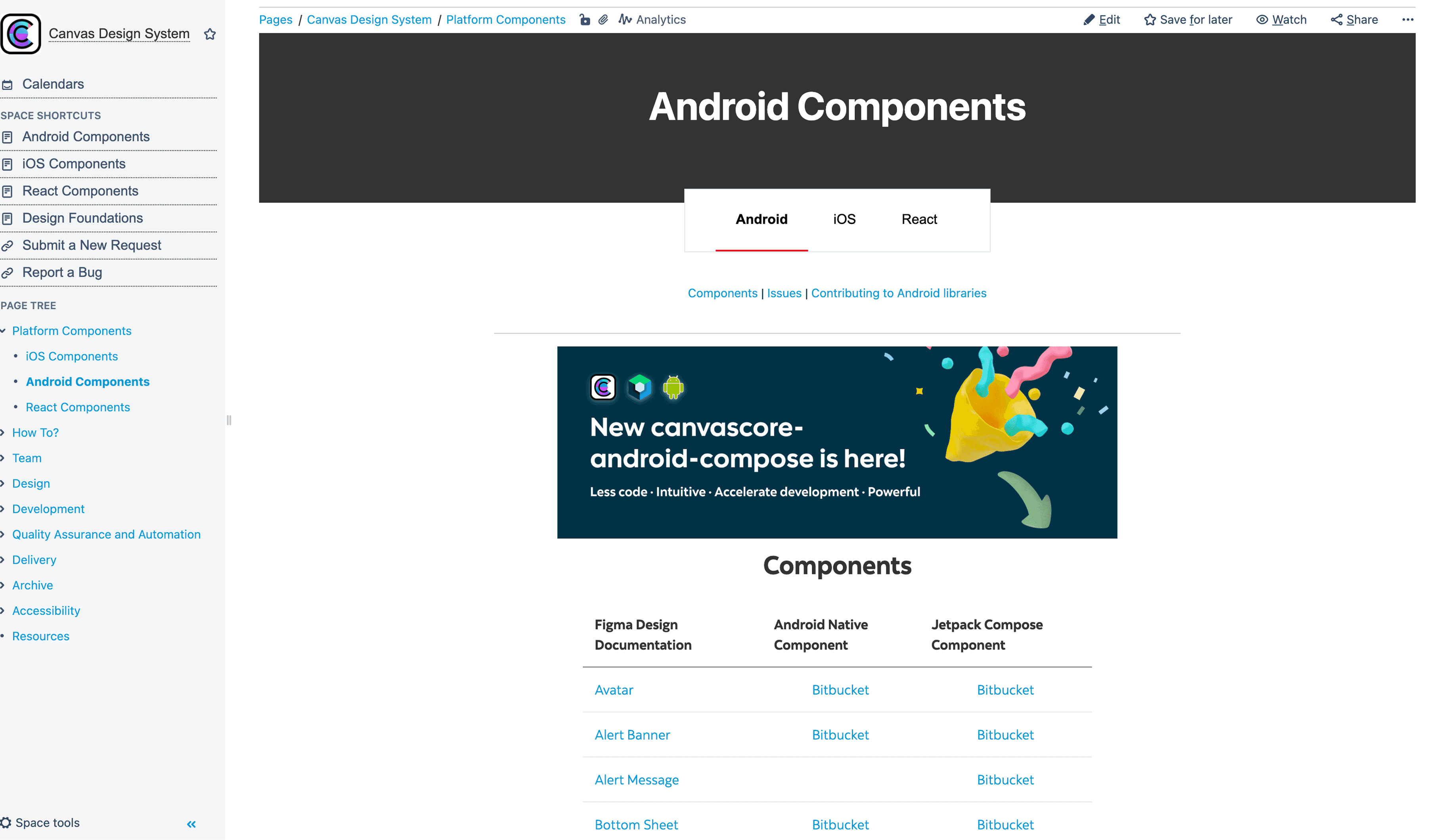
Figma Libraries to support 3 development framework
iOS
As a designer, leading the transition from Canvas Core to Canvas 2.0 has been an incredible journey. By embracing industry advancements, fostering collaboration, and optimizing our workflows, we’ve built a design system that is not just more efficient—but also more adaptable, scalable, and empowering for every designer and developer at Scotiabank.
Canvas 2.0 represents more than a technical upgrade; it’s a shift in how we work, communicate, and build together. By strengthening the partnership between design and development, we’ve created a system that will continue to grow, evolve, and support the digital experiences of the future.