Role: Senior Product Designer
Platform: iOS + Android
Team: Cross-functional squad (13+)
Timeline: Aug 2024 – Mar 2025
At a glance
Problem
Customers had to choose a transfer method before seeing what it cost.
Approach
Two rounds of customer research → prototype testing → MVP build.
Core move
Reordered the flow to match customers’ mental model, and put fee/rate/speed comparison upfront.
Outcome
11.7% reduction in transfer journey abandonment ·
task completion 72.4% → 84.1%.
The problem
Sending money abroad through Scotiabank meant committing before you understood what you were committing to.
The app had two separate entry points — Bank Deposit and Western Union — and customers had to pick one before seeing what either would cost, how long it would take, or whether the recipient’s country was even supported. Fees, exchange rates, delivery speed, and required recipient details all lived downstream of a decision customers had no basis to make.
Rail selection was partitioned. There was no way to compare the factors that actually drive the decision. Customers described the experience as anxious — and the data agreed: they dropped off.
The opacity was visible from outside the bank too. Third-party remittance comparison sites noted that Scotiabank’s exchange rate changed daily and that customers could only discover their rate after starting the transfer — the exact sequencing problem we set out to fix.
The competitive floor was rising too. Wise, Remitly, and WorldRemit had made upfront rate comparison table stakes, Visa Direct and Mastercard Send were reshaping delivery-speed expectations, and every other Canadian big-five bank was investing in its own IMT roadmap.
The question we set out to answer: how might we help customers make an informed decision about how to send money, so that fewer of them abandon the journey?

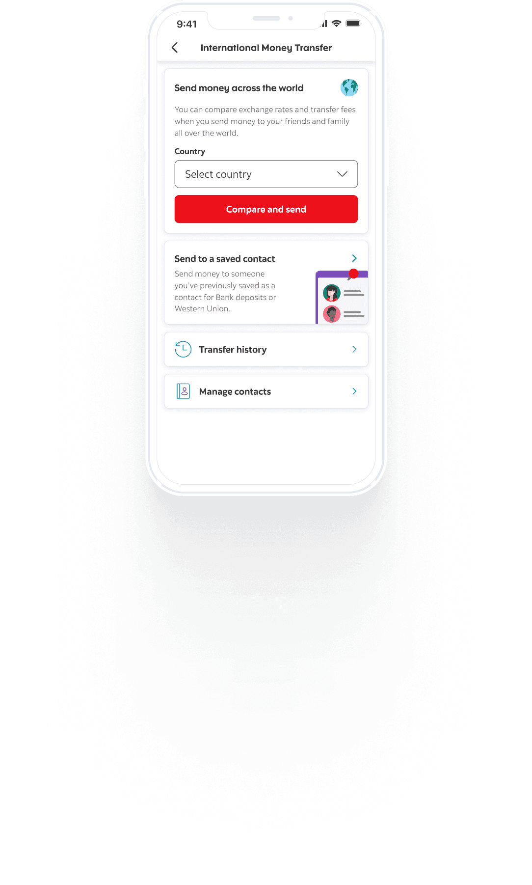
Old UI Display


Discovery
We ran two consecutive rounds of customer research. Phase 1 surfaced new insights; Phase 1.2 reinforced them and added texture around Gen Z expectations. I worked with our UX researcher to synthesize both rounds into five challenge themes mapped across the customer journey.
Entry
Incongruent expectations — many customers didn’t know their bank offered IMT at all, and assumed bank transfers would be slower, more expensive, and more tedious than a fintech.
Financial inclusion — country availability, how senders could fund a transfer, and how recipients could actually receive money were all constrained.
Experience
Outcome anxiety — the dominant theme. Customers wanted tracking, speed, fewer input fields, and visible customer care. Waiting without visibility was the worst part of the experience.
Engagement
Crucial life moments — customers wanted to rely on us in emergencies: contingency sending, express speed.
Clear and consistent value — pricing was not a deal breaker. Pricing transparency was. Customers wanted to know what they were paying for and how the fee structure changed by situation.
Three insights were prioritized for build:
Mental model mismatch — the flow asked questions in the wrong order.
Transaction tracking and status is a default expectation, not a delighter.
Pricing transparency is the deciding factor, not price itself.

The insight that reframed the project
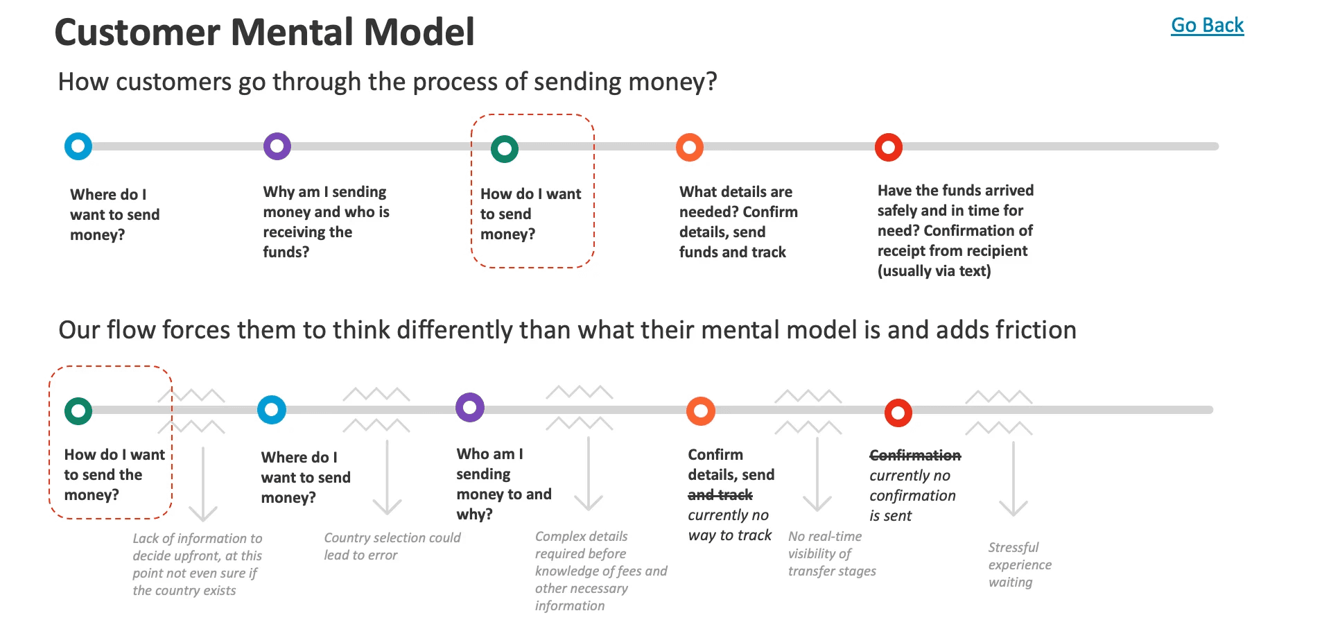
Mapping how customers reason about sending money against how the product asked them to reason revealed the whole problem in one frame.
How customers think:
Where am I sending money? → Why, and who’s receiving it? → How do I want to send it? → What details are needed, and can I track it? → Did it arrive safely?
What the product asked:
How do you want to send it? → Where? → Who to? → Confirm and send (no tracking) → (no confirmation)
Every step was one question ahead of what the customer could actually answer. Customers were being asked to choose a rail before they knew if their country was supported, and to commit to a transfer before they knew what it cost. The flow ended in silence — no tracking, no confirmation of receipt.
The friction wasn’t in any individual screen. It was in the sequence.
Design principles
Three principles came out of research and governed every decision after:
Ask in the order customers already think.
Sequence is a design surface. Reordering questions cost nothing to build and removed the largest single source of friction.
Put the tradeoff on screen before the commitment.
Customers weren’t looking for the cheapest option. They were looking for enough information to feel confident about their choice.
Reduce anxiety with information, not reassurance.
“Don’t worry” is not a feature. Delivery estimates, live status, and recipient-side confirmation are.
What I designed
1. One entry point, country first
I consolidated the two separate entry points — Bank Deposit and Western Union — into a single International Money Transfer destination inside Move Money, and led with country selection against a consolidated list spanning both rails.
This directly addressed the mental model mismatch. Customers now start where they naturally start: where is this money going? Channel selection moves downstream, to the point where it’s an informed choice rather than a blind one.
For repeat senders, a parallel “send to a saved contact” path skips comparison entirely — the contact already encodes the country and the rail.
THE JOURNEY
Designed as three moves
Every screen mapped to one of three intentions — get people in without friction, make the tradeoff obvious, and prove the money arrived.
ENTRY
Meet people where they think
A country-first Move Money flow that asks questions in the order customers already think — no jargon, no dead ends.
EXPERIENCE
Put the tradeoff on screen
Compare and Send shows rate, fee and arrival side by side, so confidence comes before commitment.
ENGAGEMENT
Prove the money arrived
Live status, delivery estimates and recipient-side confirmation close the loop and replace anxiety with facts.


2. Compare and Send
The centerpiece. A single screen that puts both rails side by side with the four factors customers said drive the decision: estimated delivery time, exchange rate, fees, and total cost. Design decisions that made it work:
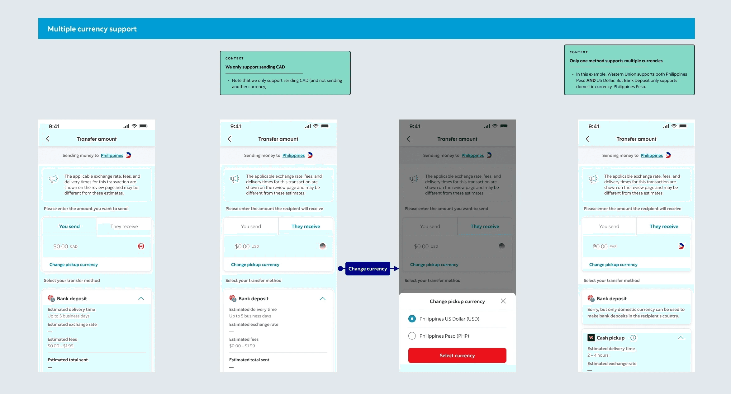
A You send / They receive toggle. Customers reason in both directions — sometimes “I have $100 to send,” sometimes “they need to receive ₹5,500.” Supporting both removed a mental-math burden that research showed caused hesitation.
Expanded and collapsed card states. Full breakdown when comparing, condensed once decided, so the screen doesn’t stay dense after density stops being useful.
Required-details disclosure inline. Each rail surfaces what it will need from the recipient before selection — full address and banking code for Bank Deposit, first and last name for Western Union. Moving them upstream turned a mid-flow surprise into a selection criterion.
Estimate framing. Rates and fees are engineering-determined later, so every figure is explicitly labeled as an estimate, with a persistent note that final values appear on the review page.

Multi-currency support added a further layer: Western Union supports both USD and PHP into the Philippines, while Bank Deposit supports domestic currency only. I designed a pickup-currency selector plus an inline explanation on the constrained rail — so an unavailable option teaches the customer something rather than just failing.
3. Closing the loop: Transfer status
Research was unambiguous — tracking and confirmation weren't enhancements, they were the baseline expectation. The old flow ended in silence, and customers were screenshotting confirmation screens because the product gave them nothing else to hold onto.
I designed the full transfer status experience: a five-state timeline covering Created, Submitting, Processing, In transit, and Received, plus every way a transfer can fail.
The Happy Path 😊
The timeline shows all five states at once, with completed steps filled, the current step emphasised, and future steps greyed. A customer can see where their money is and what happens next without tapping anything.
The detail that took the most work was tense. Each step's copy rewrites itself depending on where the transfer currently sits — your transfer will be processed, then is being processed, then was processed. It's a small system, but it's the difference between a status page that feels live and one that reads like a static form. Getting it right meant specifying three copy variants for every step and defining which state triggers which.
I also added a Share action that outputs the status as plain text. Customers were already screenshotting; this gave them a supported version of the behaviour they'd invented.

The Unhappy Path ☹️
Most of the design work lived here. A returned transfer isn't one state — it's five, and collapsing them into a single generic error would have re-created exactly the anxiety this project existed to remove.
I designed each with its own copy, matched to what the customer could actually do about it:
Rejected by the recipient's bank — names the cause and confirms the funds are back, because the customer may need to check the account details with their recipient
Technical failure — explicitly tells the customer to try again, because retrying will probably work
Compliance rejection — deliberately generic. Banks can't disclose why a transfer was flagged, so the design goal here was to be non-alarming and clearly final rather than falsely explanatory
Failed before submission — for cases where the sending account itself couldn't be resolved
Failed in transit — the hardest case, where funds have left and returned, and the recipient's side is invisible to us
Every returned state confirms the money is back in the account, and every screen carries a route to the chatbot. A dead end with no next action was the one outcome I wasn't willing to ship.
Designing around a backend gap
The system couldn't supply dates for future states, which meant no estimated delivery date on the status page. Rather than fabricate one or leave the space empty, I wrote forward-looking copy that sets expectations without promising a date — your transfer should be deposited soon, contact the recipient to confirm. Honest about the uncertainty, still useful.

“This is so easy to compare and decide. All the information I need is right in front of me.”
— Remittance customer, moderated usability session
4. The craft underneath
Simplicity on the surface required a lot of specification below it:
Contact management across both rails — sectioned by channel, with detail views, delete flows, and separate empty states for each rail independently.
Full light and dark mode across every screen and state.
Error and edge states — missing amount, unsupported country, unavailable currency, partial contact data.
Accessibility — worked directly with our accessibility specialist through design; contrast, focus order, and screen reader labeling reviewed per screen.
Documented backlog constraints — contact editing didn’t exist and wasn’t scheduled that fiscal year, so I designed around the gap rather than pretending it wasn’t there.

Designing the intelligence layer
Scotiabank was not a bank without AI. The Global AI Platform had been running since 2020, and Scotia Smart Money — built on Personetics — was already delivering predictive insights, cash-flow analysis, and budgeting intelligence to millions through Advice+. C.MEE, the bank’s decision engine, analyzed signals across touchpoints to determine what advice was most relevant at any moment.
The infrastructure for personalization existed. It just hadn’t reached international transfers.
Our competitive analysis flagged Smart Money integration as an explicit opportunity for IMT. Research supported it: customers responded positively to smart interventions, resend options, and scheduled reminders, and Gen Z participants expected proactive experiences as a baseline rather than a delighter.
The design problem was not whether to use intelligence. It was how to surface it in a context where a wrong guess costs a customer real money.
Validation
We prototype-tested the redesigned flow with customers, walking the full seven-step journey. Reactions clustered into three themes:
Intuitive — customers navigated the country-first flow comfortably. One existing IMT customer recognized the change and immediately preferred it. Several compared it favourably to their primary banking app.
Transparent — upfront fee, rate, and speed comparison drew the strongest positive response. Customers described feeling equipped to make a fully informed choice, and several rated the comparison screen the best they’d seen from any financial institution.
Empowering — tracking via SMS and email was liked unanimously, with customers specifically noting that keeping the recipient informed was something no other bank had offered them.
What didn’t work. Testing was equally useful for what it broke:
The channel selection screen was text-heavy enough that some customers missed there were two options at all — we added a separating banner, which resolved it in the next round.
“Send Amount” vs “Receive Amount” copy caused confusion; we reverted to “You send” / “They receive.”
The SMS/email opt-in went unnoticed by several customers, likely due to proximity to the primary CTA — flagged for follow-up.
Terminology like “State vs Province” and non-optional PIN codes for specific corridors created friction we hadn’t anticipated in recipient entry.


Outcomes
11.7% reduction in transfer journey abandonment.
Task completion improved from 72.4% to 84.1%.
Consolidated two fragmented entry points into a single IMT experience.
Established comparison patterns reused across subsequent retail payment work.
Reflection
The highest-leverage change on this project cost almost nothing to build. Reordering the flow to start with country selection was not a new feature — it was the same steps in a different sequence. It came out of one research finding, and it addressed more customer friction than anything else we shipped.
The thing I’d push harder on next time is the gap between estimated and final values. It’s an artifact of when rates are engineering-determined, and while we labeled it honestly, customers still asked about it. That’s a systems problem worth solving upstream rather than a copy problem to manage downstream — and it’s the same problem that has to be solved before any predicted value can be shown to a customer with confidence.
Team
Designed alongside a cross-functional squad: design lead, design manager, and design director; UX research; accessibility; two content designers; product owner and product lead; iOS and Android engineering; legal counsel; and business stakeholders in Retail Payment Products.